Infographic: A year of ACO utilization
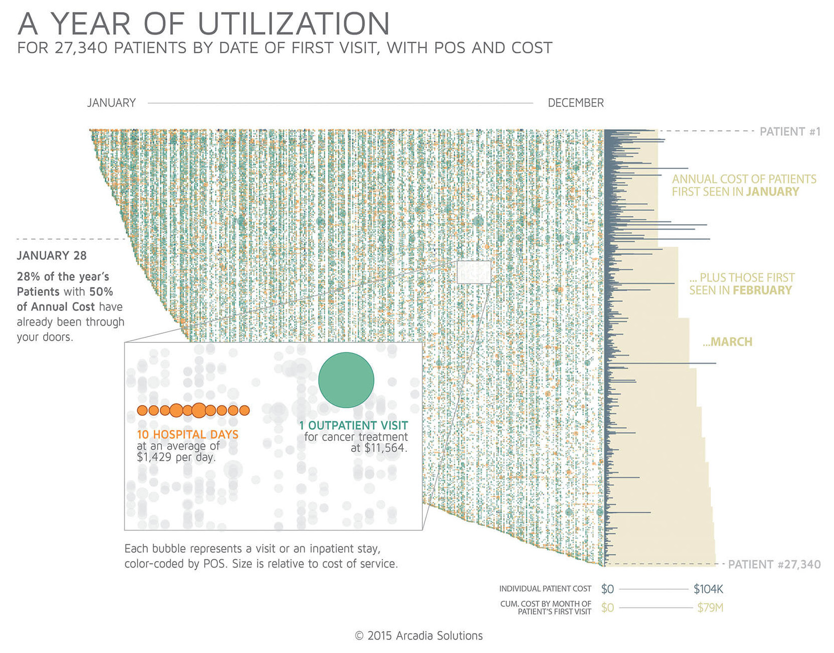
How's this for big data? This chart visualizes every visit for each of nearly 30,000 patients in an ACO, showing the quantity of data that accrues over the course of a year as the episodes of care add up.
Created by Burlington, Mass.-based Arcadia Healthcare Solutions, every bubble in the infographic represents an individual visit, with the size of the bubble showing the cost of that visit – and the color representing the place of service, whether it's hospital, outpatient setting or ED.
The X axis represents time across a one year span; the Y axis represents an individual patient per row, sorted by the first visit they had in the year.
As indicated by the curve down the left side, most patients in the ACO seek care within the first few months of the year, and continue to seek care regularly after that, according to Arcadia. Such active patients also represent a bulk of the cost, as shown by the cream-colored area chart to the right.
By the end of January, for example, patients accounting for more than 50 percent of the annual medical expense will have already had their first visit, thanks to the fact that the most complex (and costly) patients seek care frequently – and are far more likely to have an encounter early in the year, according to Arcadia.
This phenomenon can also be seen by stepping back and observing the gradient of dense bubbles in the top left fading to a much sparser spread in the bottom right; meanwhile, the gray bars represent the total annual cost for each patient and the cream-colored area chard shows cumulative cost by the month of the first visit.
Click to enlarge.


